FASA’s Doctor Who Role Playing
So, what can possibly be the difference? The game was available for what seems like the shortest time and all the supplements that hit the shelves did so during 1985 (bar none – though I’m willing to be corrected). The game, while produced in the US, managed to do the rounds internationally – certainly making it to Europe. If you blinked, you probably missed it – so, what possibly could make it worth any attention on a production level?
Well, what happened was that Colin Baker became the Doctor in 1984, though he didn’t make much of an onscreen impact until 1985. As a result, only one of the rules sets includes any images of him, all rather dubious publicity shots.
In addition, for whatever reason, FASA chose to ‘regenerate’ the rule manuals twice over the production period, creating variations most visible on an outward appearance level, with minimal content revision.
Overall there were three sets of rules, all in different covers with slight variations in box and content:
White Cover
The set with the most significant differences has white-covered rules. The cover is white card with blue-yellow border and classic Eighties Doctor Who logo. A front view of the TARDIS sits in the middle of the cover, with the FASA logo on the righthandside. Notable as well is the big picture of a maniacally grinning picture of Tom Baker on the back, with FASA logo on the lower right, and a small Doctor Who logo on the upper left.
Smooth Cover
The smooth cover version is by far the most understated of all the versions, but also the cheapest looking. The card cover is smooth and primarily a mottled brown, dark brown on light. It seems like FASA were trying to get across a feel like a journal. There are dark brown triangles on the outer corners, like some kind of leather edging. The TARDIS and Doctor Who logo on the front cover are very small indeed, sitting in the middle. About a third of the height of the cover, and a fifth of the width.
Fancy Cover
The fancy cover is by far the most elaborate and impressive to look at and feel. Yes, feel. The covers of the three manuals are made from a thick card that is textured in an approximation of rough leather. The border of the manuals are all fancy scrolling, with the title of each manual displayed in an unfurled, colour-coded banner. The TARDIS is visible just above centre, the Doctor Who logo hovering above it. The FASA logo is very small and low, right at the base of the cover in the middle. The back is identical in style with the FASA logo contained within an elaborate frame at the centre.
Look and Feel
The antique scrolling and texture of the fancy covered version make it far preferable to either of the others. The problem with the smooth covered version is that it comes across feeling just so cheap. On the otherhand, the white covered version goes beyond that and actually looks like some kind of playtesters demo version. It is quite a strange breadth of difference that seems quite inexplicable. For just a card cover, the fancy version just has just visual and tactile beauty – the other two just don’t come close.
The Box
A difference that seemed common to some other FASA launches – like Star Trek – was that the earliest edition – the White version – has an original, painted box cover. The picture depicts Tom Baker’s Doctor and Leela on a blue and black background seen through what appears to be something like the Guardian of Forever – although it may, more likely, be the hooded outer edges of The Master, c. The Deadly Assassin, as played by Peter Pratt. The picture, judging by the miniscule signature, is probably by David Marsh, dated 1985.
The other version of the box – used for Smooth and Fancy editions – has a photo-image of Tom and Leela on the upper right at the core of a outward swirl of dates, with a red/orange Doctor Who logo in the top left, a TARDIS in the bottom left and the FASA logo in the bottom right. This is the first time the tagline Adventures Through Time and Space appears on the box.
TARDIS Model Variants – Under the Hood
It might seem a little odd to go through the somewhat dry subject of what’s different amidst these varied editions of the same game. However, I’m sure that enough reviews have been done in the past – with very little attention to the differences in the versions. And there are many, small as they may be.
It should firstly be noted that the Smooth version has lighter printing than the other two editions. Now, in my experience, generally speaking, reprints from an original version come out darker… but I’m willing to be corrected. I have always felt that the Smooth edition was the final version printed… so maybe the lighter text is due to a poor transfer from an earlier edition.
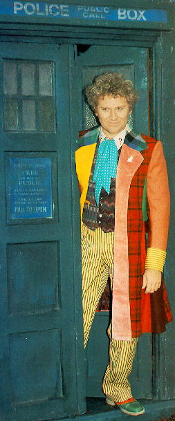
The first dozen pages contain four notable differences – some rather odd. The first page of text has a picture in the upper section of the middle column. In the Smooth and Fancy version this image is of Tom Baker and Elizabeth Sladen up against a wall in the Seeds of Doom. However, in the White version the picture is of Colin Baker, engaging in a publicity shot originally offered up for UK newspapers by the BBC when he first became the Doctor – hanging from the door of the TARDIS with his right hand and waving with his left. This image is very similar… probably taken just before the one featured in the rulebook.
Page 9 contains some slightly odd graphic alterations. Neither change, to be honest, really seems to make any sense. In the centre column of the White version the picture is a pleasant group shot of Peter Davison along with Adric, Tegan and Nyssa. However, both other editions feature a picture of Tom Baker and Sarah Jane. The other picture adorning the White edition is one of Jon Pertwee and Katy Manning – and for some inexplicable reason this doesn’t translate to the other editions where we find Jon standing in a silver suit in front of a couple of Draconians. Odd. These changes seem utterly abitrary – the page is about skill ranks, so it isn’t as if the alternate pictures are more or less appropriate than the originals.
The next mistake, on page 10, is notable for being the only layout error that I’ve come across without picking through the books with a fine-toothed comb. At the base of the first column the descriptions of skills start out with Administration – and in the White version this is just fine. However, in the other two editions, the two paragraphs in this column about the skill are swapped, so you get the second paragraph, the skill title and then the first paragraph. Rather odd.